Tuesday, 17 November 2015

Artist Research - Francis Pesamino

Dwayne "The Rock" Johnson
Francis Pesamino


This is an artwork made by Francis Pesamino which I dont think has been printed on paper or Fabric but will look cool on fabric. I find this cool because of how the text is in the image of the person which is describing the persons attributes and characteristics as seen in this image above of Dwayne Johnson.

This will be a good artist reference also a good idea on how to manipulate or warp the text into the image using Adobe Photoshop and Illustrator

Artist Research - Tee Tanuvasa - Tanuvasa Designs


This site is the Facebook page made by Tee Tanuvasa who is also a good friend of mine
who is also the one who taught me how to screen print on Fabric.

As I scrolled through his page I liked most of his designs and all of the designs that he made were all different but linked to two topics which I believe is Culture and Religion. In some of his works he uses Text to make an image, while other designs are images mixed with Samoan and Polynesian patterning which I too have a similar style to his work but my work is not up to his standard but i will get there somehow.

Artist Research - Mood NYC

This is a printed shirt from the Print company Mood NYC from New York City. This design is called Springfield Yellow.  I think this was inspired by the kids show The Simpsons

I like how they added the Simpsons character's eyes and nose.to make it as a type face  to make the word Mood.

I find this very creative as it will help me with my prints by adding an image and making it as a type face.

Artist Research - Mood NYC

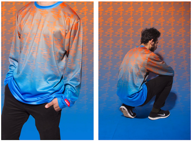
This a is a print which i find very fascinating and very symmetrical from the site Moodnyc.com which is a print company from New York City. This print is called CTRL - Heat Rock - O.B.

I find this very cool not only because of the colours but also how it blends in with each other and as you can see in these photos how its camouflaged into the background which I find amazing.

I like this design colour wise because orange and blue creates a good mixture. and blends in and what i can also see is a little bit of grey/silver which i think is the colour of the shirt which i also find amazing.

This will help me ny choosing which colour would go with this colour as you can see in the picture below the orange goes along with the blue which i will take in mind when i do my next prints.

Artist Research - Mr Vintage

This is a shirt design from the site Mr Vintage. The design was made by Colin Simon. It is also called NZZN which is logo where Colin got permission from the New Zealand Olympic Committee.


I like how basic and simplistic this looks but at the same time how clever this designer is using shapes to make the text as seen in this photo of the letters NZZN.

This design will give me great Ideas on how to not only manipulate but also how to arrange shapes to make text and this just gives me ideas on how i can utilise my photoshop and illustrator skills.

Artist Research - Mr Vintage

All Blacks 2015 Champs
This image is an image from the site Mr Vintage.

I find this image very creative because I like the way how the designer used text and made it into a big image of text where the last names of the All Blacks roster are formed together to make a big number 15.

This print is obviously printed on fabric and this has given me an idea in the near future when I print on Fabric using Text and making it into a large image of text. This also gives me an idea on what types of Font i will use to print on either paper or fabric

Sunday, 15 November 2015

Artist Research - Tobias Teixeira da Fonseca - Threadless

This is a print by Tobias Teixeira da Fonseca which I found through the site Threadless. The image below is the title of this Print.


I found this funny and that is how it caught my attention and I like the way how detailed the print is as if it was drawn on a shirt so i find this cool because this is my form or style of art. So when i think of registration I think it was printed in one colour which i find easy but yet so interesting and quite funny.

Artist Research - Rendra Sy - Threadless

This Design is a Print that I got off from the website Threadless. This is a design made by Rendra Sy called D.O.T.U.
D.O.T.U.
Rendra Sy
Print on T Shirt

This design caught my eye because I like how there are multiple colours being printed in this image and how they all blend in with the black T shirt. I also like the Lines of the red, blue , and yellow.

As far as how registration is being used, I find it hard on how this person printed this and what colour they used first. From my point of view obviously they printed white first just to make the colours stand out and look much brighter and I am guessing that the next colours that this person printed was blue, red, and yellow.

i find this print very creative and somehow in the near future I get to do something like this with 3 of my own colours

Thursday, 12 November 2015

Hand Cut Prints

These were my first prints before I starting exposing and coating the screens with the emulsion so I was given a task to draw or get an image from the computer and so i did and the aim for this task was about registration and how to register the prints using 2 and 3 colors.

Bulky Boy - Sky Blue
1 color

Bulky Boy - Blue and Red
2 Colours Blended

Bulky Boy - White with blue outline
2 Colours

Detroit Lions - Pink and Blue
2 colours

San Francisco 49ers - Black, Red, and Yellow
3 colour print

Bitmap Images

These images were prints that i made using Photoshop taking an image from either the web or camera and editing it and transferring the image into a bitmap file. After that I started exposing the image and printed on paper

Black
This print went well for me but the only concern i was having trouble with was pressure, i did not know how hard or how soft or even how slow or how fast i needed to print on paper because i never print on paper especially on photocopying paper but this is a good experience for me to know how much pressure i need to print on paper.

This was my 2nd attempt but I used the color blue and printed it on cardboard paper. It came out alright but it was the same situation and as you can see that you can't really see my face only a little bit.

This was my 3rd attempt and it just got worse as you can't really see the image as if it was going to look like a silhouette.

This was my 4th and final attempt but instead of just printing the image I started using Text as the Background and so I used my last name as an example and repeated it throughout the image.
It came out the way that I expected it to be and now you can see my face and this is my best out of the rest of the other images.

Photoshop & Illustrator Prints

These Images are prints that I printed on paper and fabric. They were first made and edited on Adobe Photoshop and Illustrator CC 2014 and then printed and exposed the images to the screen which was coated with the emulsion which is a mixture of Fotolac and Dichromate Sensitiser after which i washed the design off of the emulsion and started printing these images or designs and these are the results.

The Idea with these prints were to combine the images/logos and text together and create the two as an image.

Olomautu
Font: Freshman
Photoshop and Illustrator
Portrait with Repetition of text as Background
Printed on A4 paper

Curtis Custom Prints
Font: Freshman
Illustrator 
Printed on Fabric

Birthday Boy - 20 Years Strong
Fonts: Freshman/Birds Of Paradise
Photoshop and Illustrator
Printed on Fabric

Feel Good Movement - It's Always Great to FEEL GOOD
Font: Bebas Neue
Photoshop and Illustrator
Printed on Cartridge Paper


"Work Hard For Today To Build Up Your Tomorrow"
Font: Bebas Neue
Illustrator
Printed on Cartridge Paper

City of Sails
Font: Freshman
Photoshop
Printed on Cartridge Paper